|
Ink blending has become one of my go-to techniques for adding color to die cuts, backgrounds, stamped images, and pretty much everything! I don't claim to be an expert at it, but there are a few tips I have picked up along the way that has helped my blending. I'll share a few of these tips with you in this post.
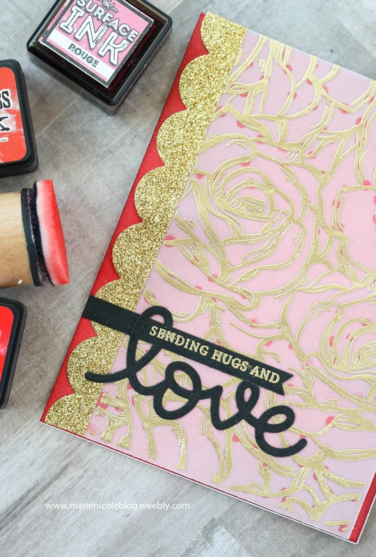
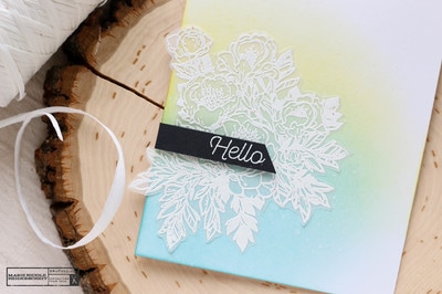
For the color on the background of this card, I blended some different shades of red together to create an even color to stand out behind this piece of vellum that was stamped and embossed. 
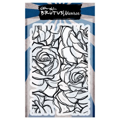
The vellum piece on the card is embossed in some of Brutus Monroe's Gilded Embossing Powder, and the stamp used is Brutus Monroe's Rose Garden Background Stamp. I also added a piece of gold washi tape to one side that I die cut with a scalloped border die. Ok, so on to the ink blending tips! I'm just covering a few questions that I most frequently hear asked. Q: Do I need high quality cardstock to get a good blend? A: Yes and No! I say this because YES, a high quality cardstock will get you a better blend because it will take the ink better, but at the same time NO, because ink blending is still possible on cheap cardstock. All the cards you see me create are built on cheap department store cardstock. Also remember that sometimes if you leave your paper for 10-15 minutes and come back, it may look a little smoother because you have given the paper time to soak in the ink. Q: Why does my ink tool leave lines or marks? A: Several reasons, one of them being that your foam blender may be new or not yet "broken in". Once you use your foam pad for a while, the fibers get broken down a bit and become softer. Also, as you use it, the fibers also become more saturated with ink, which will help to apply ink more evenly. Another way to avoid those lines is to start blending off your page and then to lightly blend into the paper coming in from the edges. Q: Why doesn't my blending look smooth and seamless? A: Again, there could be a few reasons here. One being the last question we covered, and two being that you may not have added enough ink! Sometimes to get a nice even blend you really have to work at it. My motto is, "Just Keep Blending!" (think like Dori!). Put some time and elbow grease into it and also try to add enough ink. When you start off on white paper, you might see some of those foam pad marks or lines, but as the paper gets saturated they even out. Also, blending lighter inks can be more difficult than darker inks. Get some ink on your foam tool, tap it off on some scratch paper, and lightly start your blending. You can always go darker but its harder to go lighter! I hope these have been some helpful tips for you! I have a video here of the card I made, and I also explain some of these tips. Enjoy! 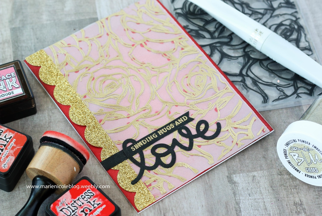
If you have any wisdom to offer on ink blending, or if I forgot to mention something that would be helpful, please feel free to comment below! I love hearing from all of you! Happy Crafting!
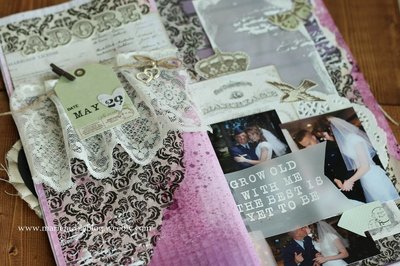
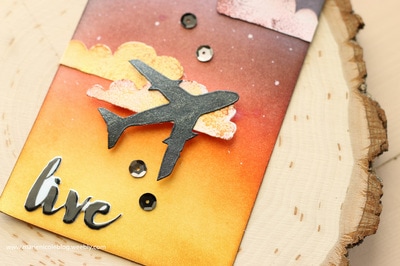
More from Marie Nicole...
1 Comment
This card was created with a few items that I have not played with in a while. Sometimes I like to dig into my supplies and revisit some of my old favorites to get my creative inspiration flowing again! I also try to play around with different looks and styles than my usual feminine, clean and simple style.
This card is still quite simple, as it doesn't have a ton of embellishments, but the background makes it stand out. 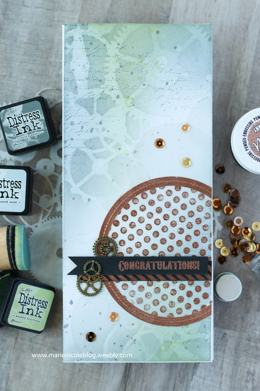
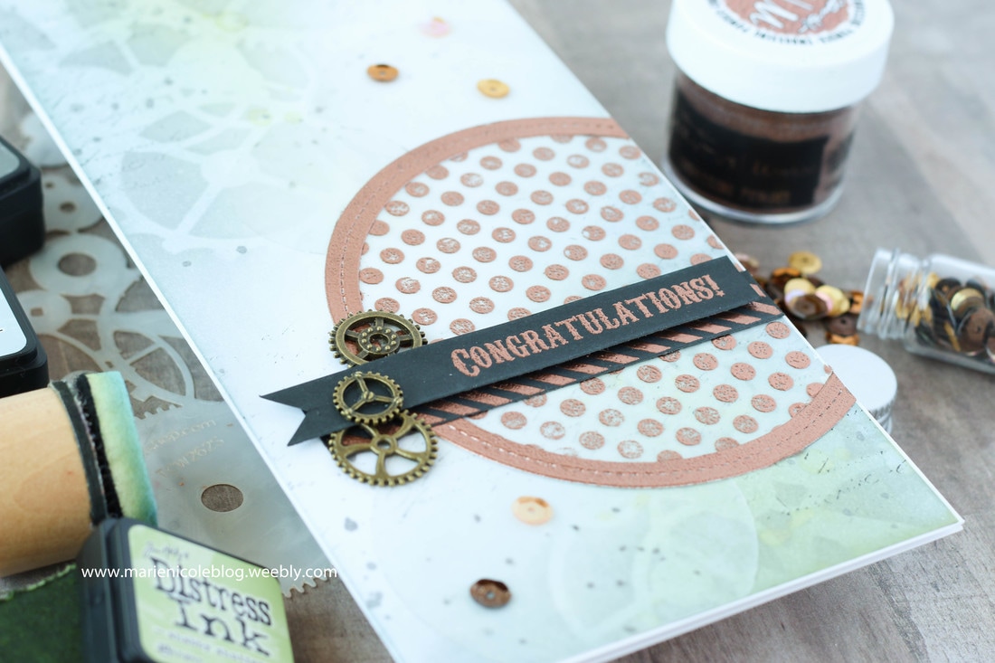
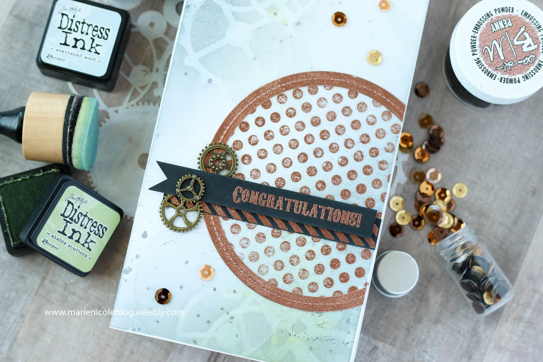
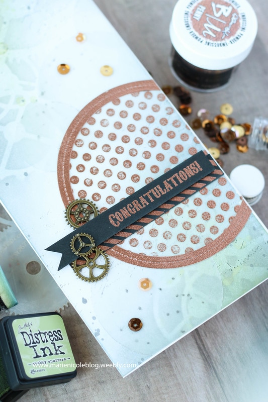
I began with a Long and Skinny card base from Canvas Corp Brands. Then, I stenciled some Hickory Smoke Distress Ink over my TCW Gears Stencil. After removing the stencil, I added some Weathered Wood over the Hickory Smoke. It gave a grey-blue color that reminded me of metal gears. Next, using my fingers and a paintbrush, I flicked on some water droplets to get the ink moving. After that was dry, Shabby Shutters Ink was blended over the top, highlighting where those droplets had been. Then, to add just a little more interest, I also stamped some faded text using Black Soot Distress Ink.
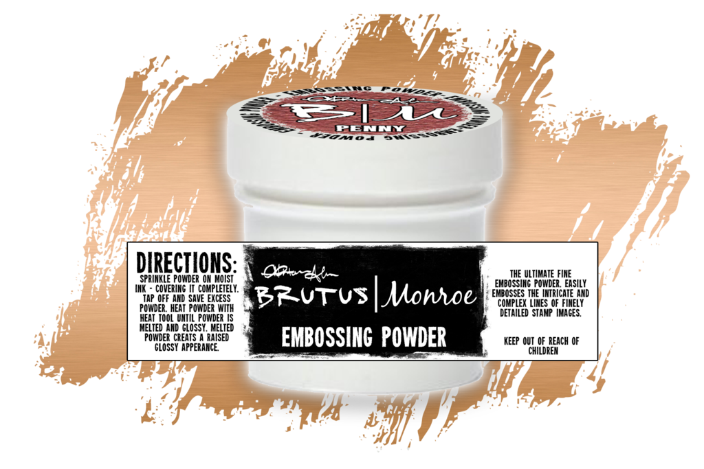
Next, using some Lawn Fawn Circle Frame Dies, I cut out several different sizes of circles from vellum. The big circle was stamped with a polka dot stamp and embossed with some Brutus Monroe Penny Embossing Powder. I love this copper powder- it shines just like the metal! I also embossed one of the frames to adhere around the circle so that it would make the big one stand out. The other circles where adhered in the background. They are very subtle, but the add some interest without taking away from the background. 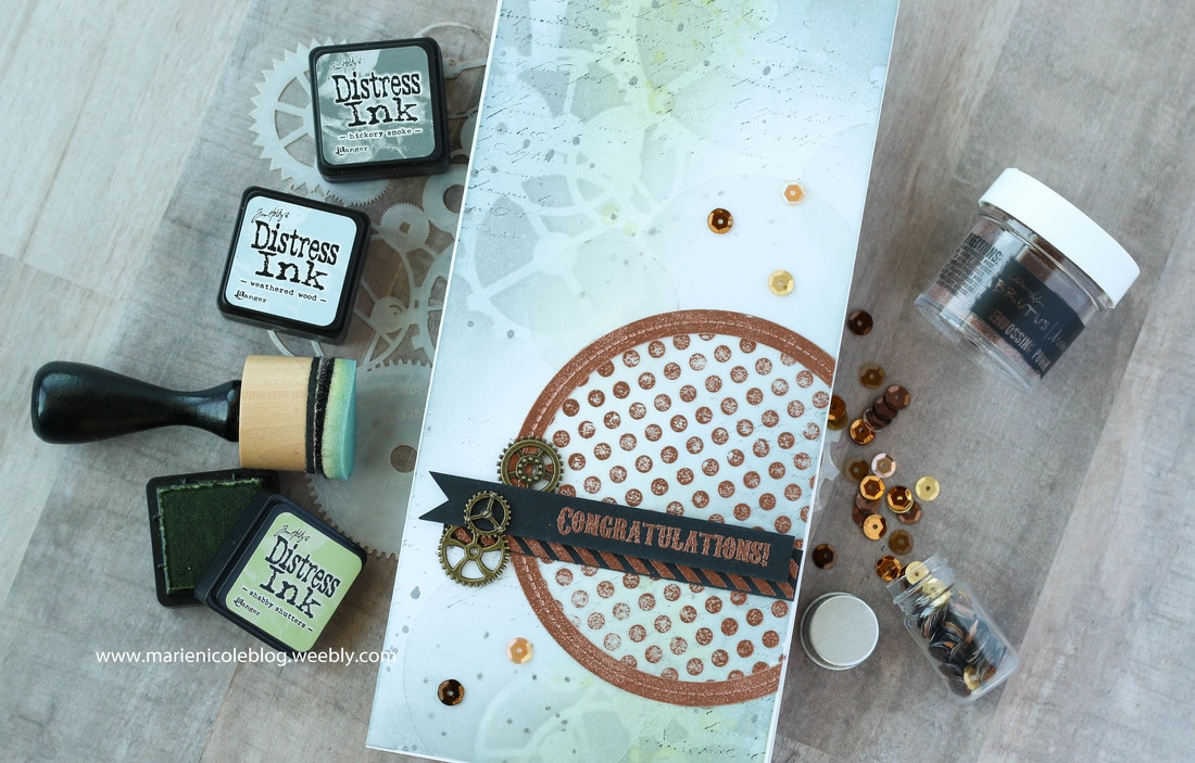
The sentiment was also stamped and embossed in Penny, as well as a strip of black cardstock that was stamped with a striped pattern. To embellish, just a few bronze gears were added, and then a few gold sequins. Like I had mentioned, its a different style than my normal girly cards, but I like it! It would be a great card to give to guys to celebrate and achievement. Thanks for stopping by today! If you are interested in any of these items, please check out the links below!
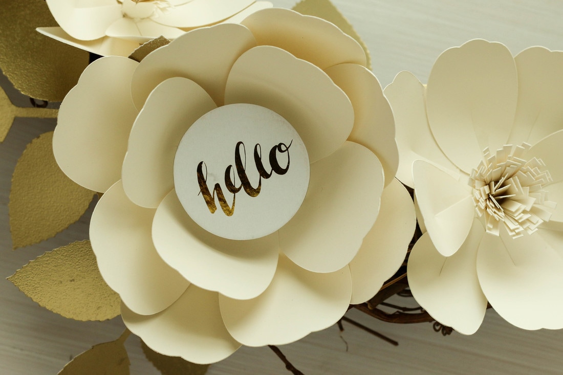
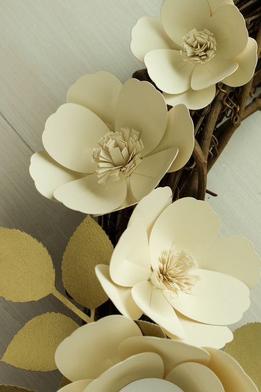
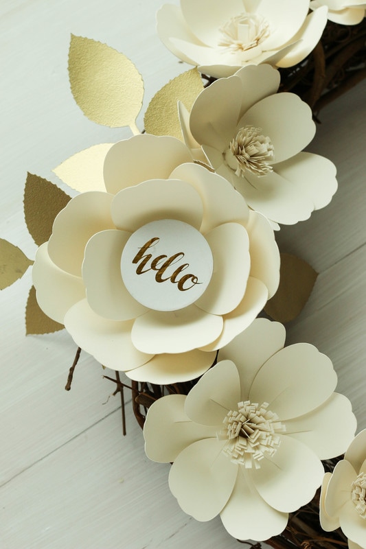
More from Marie Nicole...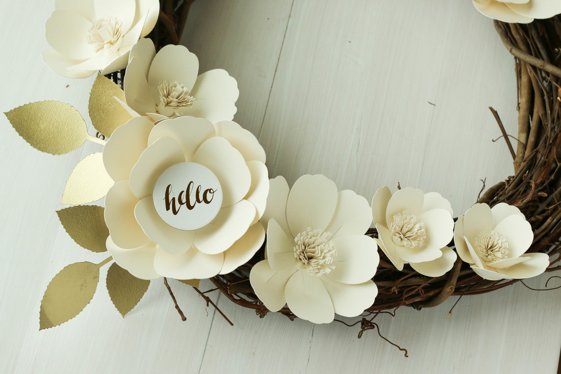 Not sure about you, but this paper flower trend has me totally excited. I love the look of those giant flowers! They are just gorgeous as photo backdrops, wedding decor, nursery embellishments, and party themes! My grapevine wreath needed and update so I turned to the web to try to find paper flower templates. It was disappointing to find that most of the tutorials either wanted you to buy their template, or you had to cut all your flowers by hand. After about three hand-cut flowers I was done! So, taking what I gleaned from other tutorials, I made my own template on Cricut's Design Space. Guys... it is SO SIMPLE! You only need one basic shape- a circle.I have a video below showing exactly how I created my own petal shape and I also have dimensions included. LARGE FLOWER Circle- 3" Petals- 2"x2.75" 12-16 petals per flower MEDIUM FLOWER Circle- 2" Petals- 1 1/2"x 2.25" 8-12 petals per flower SMALL FLOWER Circle- 1 1/2" Petals- 1.25"x1.75" 8 Petals per flower Hope you enjoyed the video! I also have some photos below that show the step by step process, as well as my finished wreath. 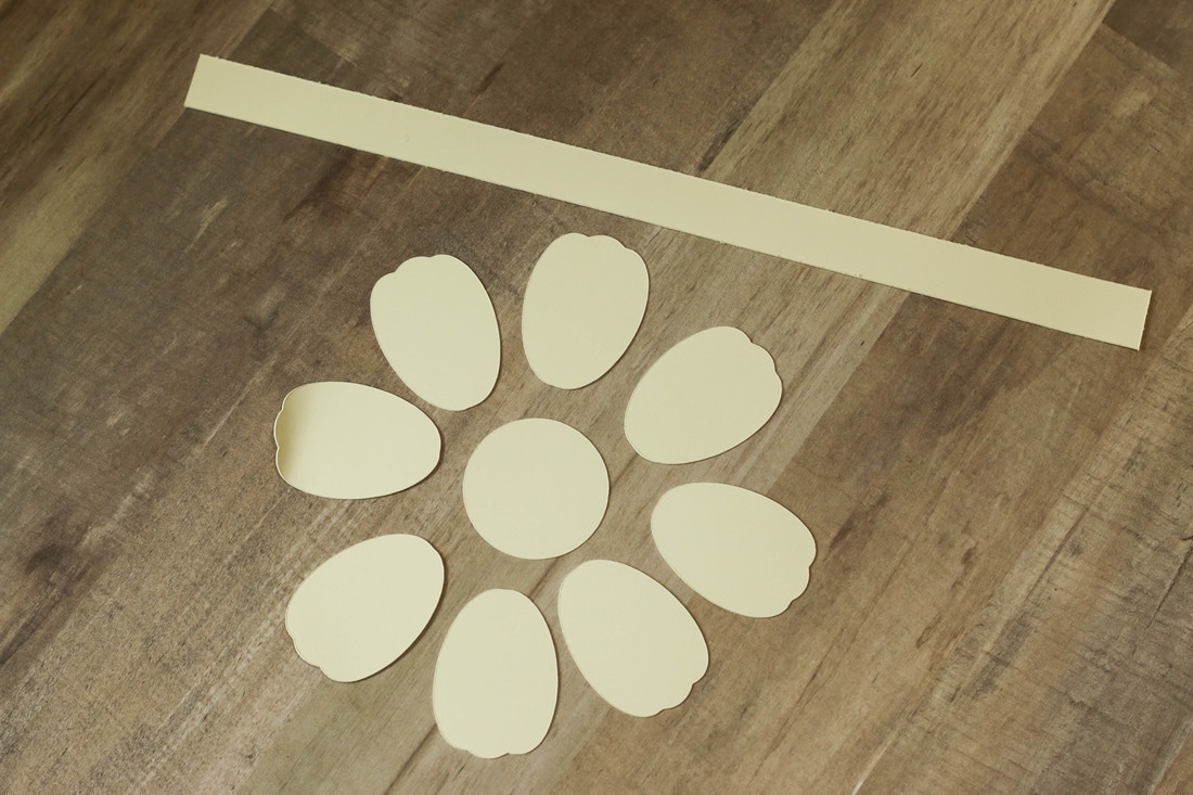 Step 1 Cut out your flower parts using the dimensions you prefer. The one I am making here is the small flower. Step 2 Take all your petals and cut a slit partway up the center, starting from the bottom. This will create two "flaps". 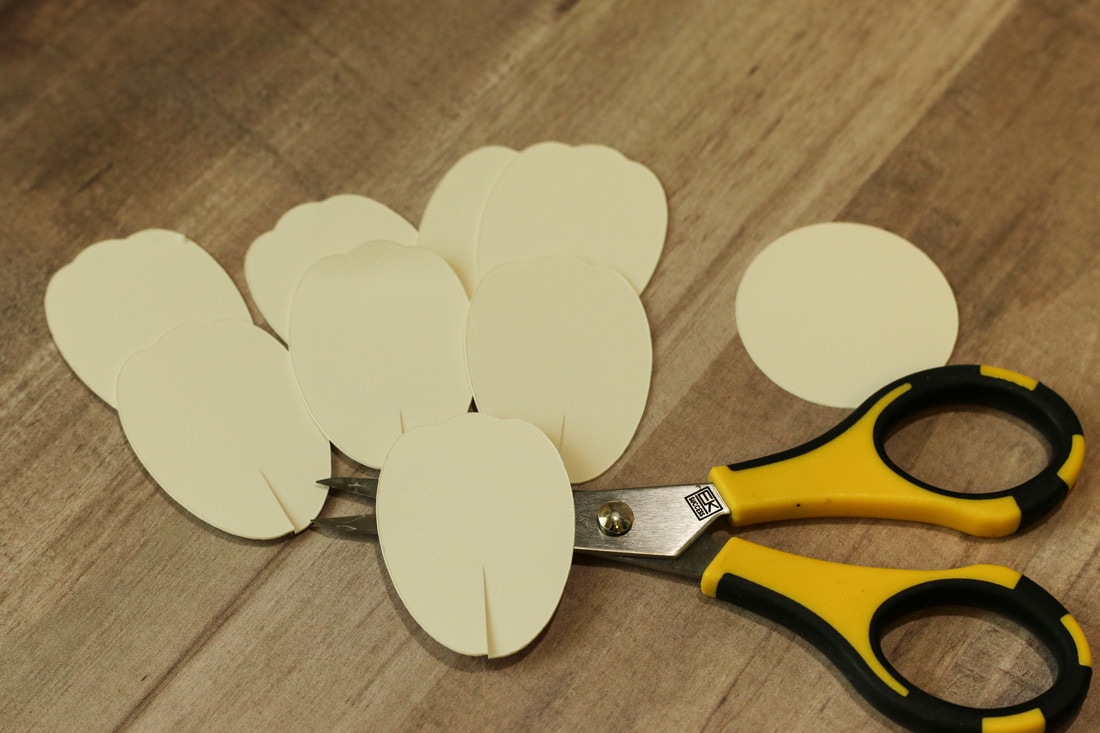 Step 3 Add some adhesive to one of the flaps. You can use tape adhesive, glue dots, hot glue, or anything you prefer. For my photos here I used tape adhesive, but hot glue will hold much stronger. After you have your adhesive added, take the other flap and fold it over to adhere them on top of each other. This will create dimension in your petals. 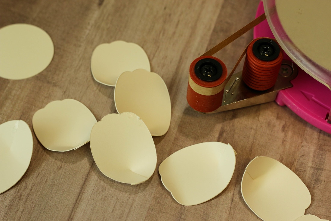 Step 4 Take your assembled petals and adhere them to the circle base. I like to add them symmetrically. This helps me space out the petals evenly. 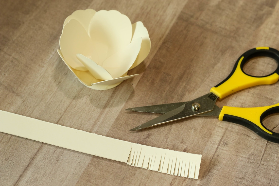 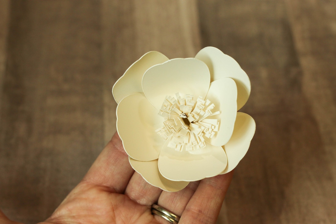 Step 5 Add your center to the flower by taking a long strip of cardstock, cutting fringes all the way along the top, and then rolling it up. Glue the rolled fringe to the middle and you are done! The biggest part of making these flowers is just cutting out the pieces. Once you have the template on your Cricut it goes very quickly! I was able to make enough to cover my wreath in no time at all. For my flowers, I used Canvas Corp's Ivory Cardstock, but you can use whatever color you would like. I hot glued them onto my wreath and then cut out a few leaves with my Cricut as well to fill in a few blank spaces. For the leaves, I also embossed them gold using Brutus Monroe's Gilded Embossing Powder along with their Embossing Ink. Ivory and gold is such a winning combination! I hope you enjoyed this tutorial and that you are able to create a ton of these gorgeous paper flowers. Thanks for stopping by! 
|

Pin it!

AuthorSo glad you found me! This blog is my little space where I can share bits about my life and my latest crafting projects (mostly handmade cards). My goal is to share, inspire, and to be a positive presence in the creative community. 

Find me on Instagram!Archives
January 2018
Categories
All
Link Love
 
|


 RSS Feed
